
Tag
SVS
Date: 12 May 2016
Comment: Comments are off
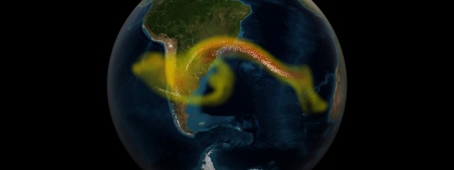
Calbuco Volcano Eruption
Visualization of results from a supercomputer model of ash and sulfur dioxide spreading from an eruption of the Calbuco volcano in April 2015. The supercomputer combines the physics and chemistry of the atmosphere with data from the NASA/NOAA/DoD Suomi NPP satellite to model the full three-dimensional structure of the volcanic cloud. Model data is compared to observation data collected from the NPP satellite. Data wa
Read More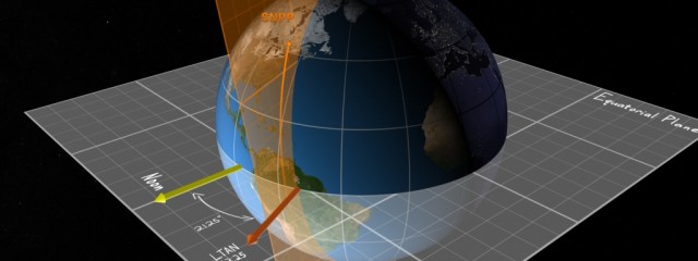
JPSS Multi Mission Concept of Operations
This visualization explains the key concepts (i.e. orbit, observation, communication, and constellation) of the NASA/NOAA Joint Polar Satellite System (JPSS) Mission. This visualization was used during a NASA mission readiness review for the JPSS constellation mission.
Read More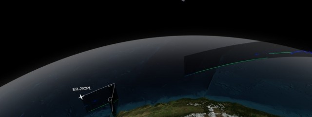
Date: 01 Oct 2015
Comment: 0
CATS/CPL Underflight
NASA’s Cloud-Aerosol Transport System, or CATS, is a lidar remote-sensing instrument taking measurements of atmospheric aerosols and clouds from the International Space Station (ISS). Launched to the ISS in January 2015, CATS is specifically intended to demonstrate a low-cost, streamlined approach to developing ISS science payloads. The CATS mission extends the data record of space-based aerosol and cloud measurement
Read More
22-year Sea Level Rise
This visualization shows total sea level change between 1992 and 2014, based on data collected from the TOPEX/Poseidon, Jason-1, and Jason-2 satellites. Blue regions are where sea level has gone down, and orange/red regions are where sea level has gone up. Since 1992, seas around the world have risen an average of nearly 3 inches. This visualization was used as part of NASA’s presence at the 2015 United Nations
Read More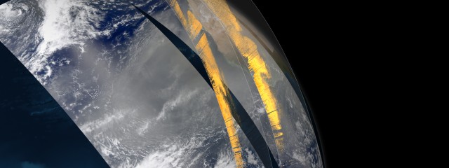
Date: 28 Feb 2015
Comment: 0
Visualizing Saharan dust crossing the Atlantic Ocean
Each year, dust from the Saharan Desert in Africa is swept up into the atmosphere, where it travels across the Atlantic Ocean towards the Amazon Rainforest in South America. On average, 27 million tons of African dust is deposited into the Amazon Basin each year. So much dust is deposited in the Amazon each year that scientists credit the phosphates found in that dust with fertilizing the Amazon Rainforest and keepi
Read More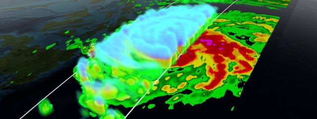
Date: 28 Feb 2015
Comment: 0
GPM Storm Visualizations
These visualizations were creating using data from NASA’s Global Precipitation Measurement (GPM) satellite. The visualization pipeline was developed at NASA’s Scientific Visualization Studio. Each of these ‘quick-turn’ visualizations were created in a day or two in order to publish within the storm’s news cycle. Data is processed in IDL, modeled in Maya, and rendered using Renderman. S
Read More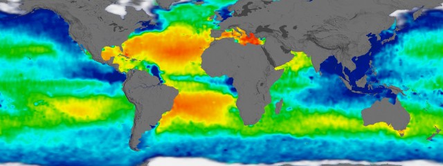
Date: 28 Nov 2014
Comment: 0
Visualizing Sea Surface Salinity
The Aquarius spacecraft is designed to measure global sea surface salinity. It is important to understand salinity, the amount of dissolved salts in water, because it will lead us to better understanding of the water cycle and can lead to improved climate models. Aquarius is a collaboration between NASA and the Space Agency of Argentina This visualization celebrates over three years of successful Aquarius observation
Read More