
GPM Storm Visualizations
These visualizations were creating using data from NASA’s Global Precipitation Measurement (GPM) satellite. The visualization pipeline was developed at NASA’s Scientific Visualization Studio. Each of these ‘quick-turn’ visualizations were created in a day or two in order to publish within the storm’s news cycle. Data is processed in IDL, modeled in Maya, and rendered using Renderman.
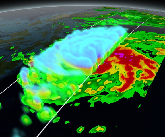
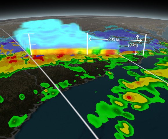
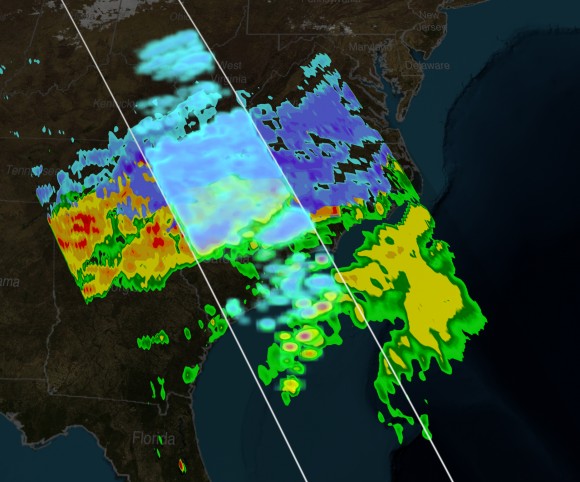
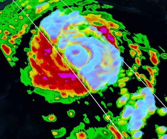
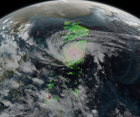
Shades of green to red represent intensity of liquid precipitation, while shades of cyan to purple represent intensity of frozen precipitation. (See the bottom of this page for more information about GPM)
Tyhpoon Hagupit:
This visualization was selected as Wired.com’s “Science Graphic of the Week”
Typhoon Vongfong:
Snow Storm over Kentucky, West Virginia, and North Carolina:
The GPM Core Observatory carries two instruments that show the location and intensity of rain and snow, which defines a crucial part of the storm structure – and how it will behave. The GPM Microwave Imager sees through the tops of clouds to observe how much and where precipitation occurs, and the Dual-frequency Precipitation Radar observes precise details of precipitation in 3-dimensions.
For forecasters, GPM’s microwave and radar data are part of the toolbox of satellite data, including other low Earth orbit and geostationary satellites, that they use to monitor tropical cyclones and hurricanes.
The addition of GPM data to the current suite of satellite data is timely. Its predecessor precipitation satellite, the Tropical Rainfall Measuring Mission, is 18 years into what was originally a three-year mission. GPM’s new high-resolution microwave imager data and the unique radar data ensure that forecasters and modelers won’t have a gap in coverage. GPM is a joint mission between NASA and the Japan Aerospace Exploration Agency. All GPM data products can be found at NASA Goddard’s Precipitation Processing Center website http://pps.gsfc.nasa.gov/.