Tag
Visualization
Date: 28 Feb 2015
Comment: 0
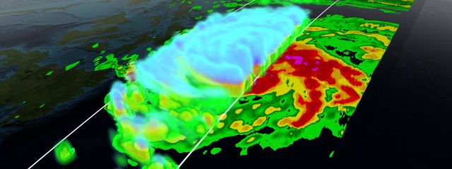
GPM Storm Visualizations
These visualizations were creating using data from NASA’s Global Precipitation Measurement (GPM) satellite. The visualization pipeline was developed at NASA’s Scientific Visualization Studio. Each of these ‘quick-turn’ visualizations were created in a day or two in order to publish within the storm’s news cycle. Data is processed in IDL, modeled in Maya, and rendered using Renderman. S
Read MoreVisualizing Active vs. Inactive Space Objects
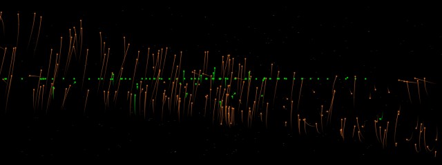
Over the past several months I’ve been working on methods to visualize objects in orbit around the earth. I created a simulation that includes all trackable objects currently in the publicly available database divided into 4 datasets – Low Earth Orbit (LEO) inactive, LEO active, Geosynchronous (GEO) inactive, and GEO active. This first video shows all active (green) vs inactive (orange) objects. The gif at the
Read More
© 2012 Kel Elkins. All Rights Reserved.


