
Visualizing Active vs. Inactive Space Objects
Over the past several months I’ve been working on methods to visualize objects in orbit around the earth. I created a simulation that includes all trackable objects currently in the publicly available database divided into 4 datasets – Low Earth Orbit (LEO) inactive, LEO active, Geosynchronous (GEO) inactive, and GEO active. This first video shows all active (green) vs inactive (orange) objects.
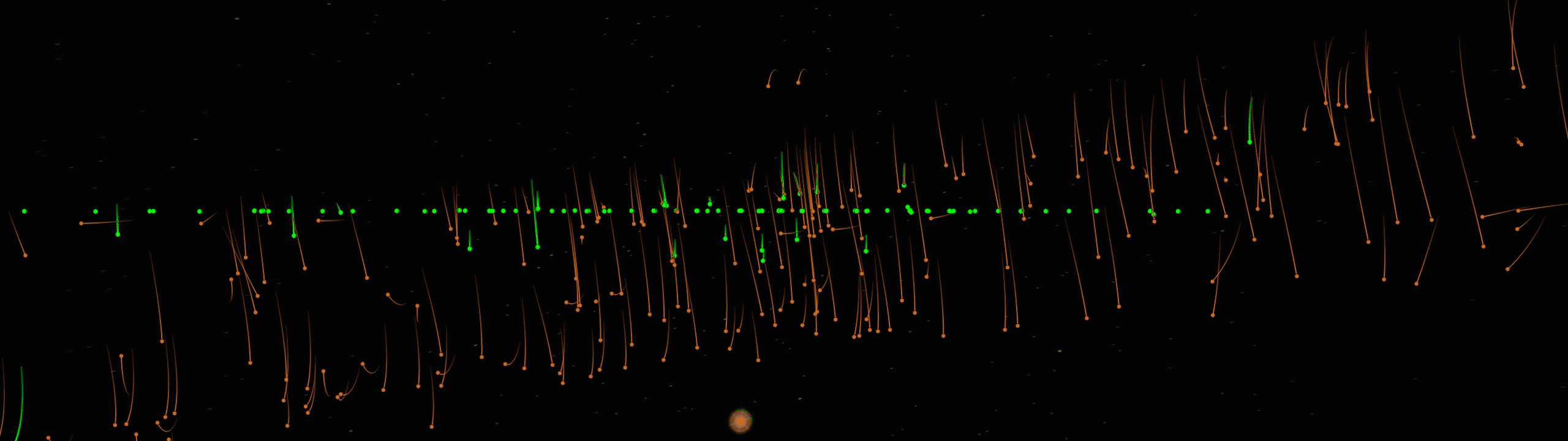
The gif at the top of this page represents a wide angle view (~100 degrees) from the perspective of someone standing on the Earth’s equator, looking straight up. All LEO (active and inactive) objects have been turned off, so you only see objects that populate the geosynchronous orbit a.k.a. the GEO belt. The GEO belt is particularly popular orbit because objects at this altitude rotate around the Earth at the same rate that the Earth rotates, which means that from the perspective of someone on the earth they appear stationary in the sky (making this orbit ideal for communications satellites). Over time, objects will begin to drift out of this dense belt of satellites, which results in a slightly inclined orbit. This variation in orbit is why you see a wave, or figure 8 pattern with most of the inactive objects. The wide video below shows a complete 360 degree view of the same simulation. The center of the video is 0 degrees latitude, or approximately the view you would see from Africa.
This next video is another view of the same simulation. This time, I have broken the view into two sections. The top line is (left to right) ~-180 to 0 degrees latitude, and the lower line is ~0 to 180 degrees latitude.
This simulation became the basis for a fully immersive, 10 projector system used at tradeshows to describe my company’s tracking and catalog capabilities. The simulation is displayed on a 360 degree, 8 projector geostationary view, a 20 ft spherical dome view, and a 3ft spherical Earth in the center of the room. The video below shows a few short clips of the system in action.
A few notes on visualizing space objects:
- This simulation includes roughly 25,000 objects – the current extent of the (publicly available) database. This generally includes all objects over 5cm long. In reality, it is estimated that there are more than 100,000 objects currently in orbit around the Earth.
- When creating visualizations like these, you have to pay close attention to marker scale. While these dots look like a dense swarm, in reality these objects are extremely far away from each other (on the order of several hundreds of miles). You can’t show the objects at a true scale because you obviously wouldn’t be able to see anything in the visualization, but at the same time you want to try to keep marker size down to be as realistic as possible. In the simulations above, the dots you see are roughly the size of New York.